Color is one of the most powerful tools for designing a home that reflects your personality, boosts your mood, and enhances your lifestyle. The colors you choose for each room don’t just affect aesthetics—they shape how a space feels and functions. Understanding the science of color and its interaction with light, emotion, and space can help you make smart choices that elevate your home’s atmosphere and value.
Whether refreshing your interiors or preparing your property for the market, here’s how to choose the right paint tones for every room.
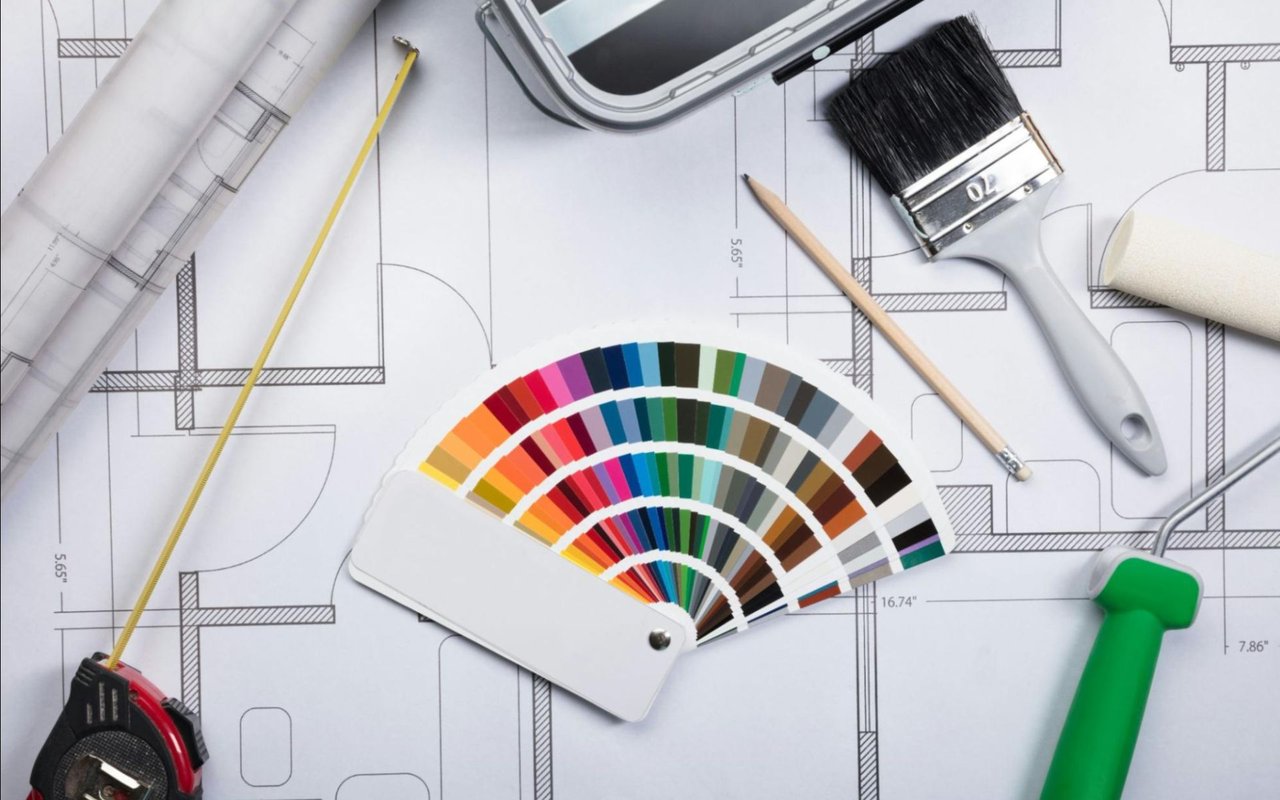
Understanding the Psychology of Color
Colors evoke emotions and can subtly influence your behavior. Here's how some of the most common hues affect mood:
- Blue: Calming and serene, ideal for bedrooms and bathrooms.
- Green: Associated with nature and balance, perfect for living rooms or home offices.
- Yellow: Uplifting and cheerful, great for kitchens or breakfast nooks.
- Red: Energizing and stimulating, best used as an accent in dining areas or lounges.
- Neutrals (white, beige, gray): Versatile and timeless, they work well in any room, especially for resale appeal.
The psychological impact of color isn’t just a trend—it’s backed by science. Studies show that blue hues can reduce heart rates and anxiety, while red can increase energy levels and appetite. By leveraging this knowledge, you can curate a home that doesn’t just look good but also feels right.
Lighting Matters More Than You Think
Before you pick up a paintbrush, observe how natural and artificial light affects your space throughout the day.
- North-facing rooms tend to have cooler light, which can make colors feel muted or stark. Warmer tones like taupe, honey, or cream can offset this.
- South-facing rooms get lots of warm, bright light. Cool tones like blue, green, or gray can help balance this.
- East-facing rooms have bright light in the morning and dimmer tones in the afternoon. Soft yellows or warm whites work beautifully here.
- West-facing rooms are warm and golden in the afternoon. Earth tones and neutrals will enhance this cozy glow.
Use paint samples and observe them at different times of the day to ensure they behave the way you want in your specific space.
Room-by-Room Color Guide
Living Room
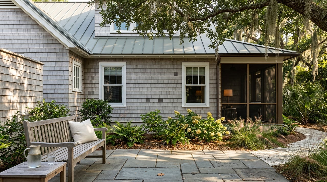
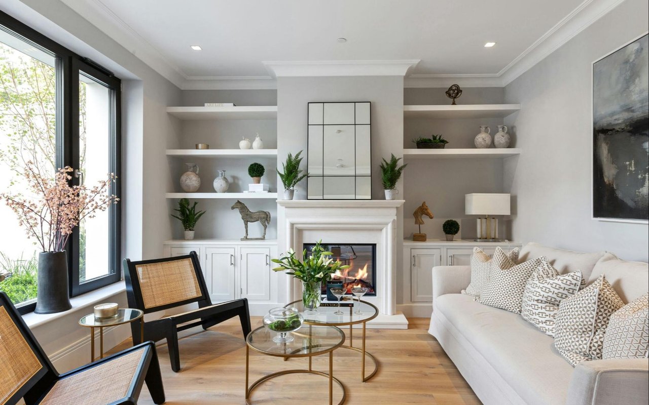
The living room is often the heart of the home—a space for entertaining, relaxing, and making memories. Choose warm neutrals like soft beige, greige, or muted greens to create a welcoming, grounded environment. If you love a bold statement, try an accent wall in navy or charcoal to add depth and sophistication.
Kitchen
The kitchen is a hub of activity, and the color palette should reflect its energy. Warm tones like buttery yellow, terracotta, or soft sage can stimulate appetite and encourage social interaction. If you prefer a more modern look, opt for crisp white cabinets paired with a splash of bold color like emerald or cobalt blue on the walls or backsplash.
Dining Room
In the dining room, rich colors like deep red, wine, or moody blue can promote conversation and create an intimate atmosphere. For a more casual feel, consider soft blush, olive, or even a patterned wallpaper for added texture.
Bedroom
Your bedroom should be a sanctuary. Soft, cool colors such as misty blue, lavender, or warm gray can help calm the mind and promote restful sleep. Avoid overly bright or stimulating hues, especially if you have trouble winding down at night.
Bathroom
Light colors work well in bathrooms to keep the space feeling clean and fresh. White, pale blue, or seafoam green create a spa-like experience. If you want a luxurious feel, try deeper tones like slate or hunter green paired with gold or brass fixtures.
Home Office
For productivity and focus, green and blue are top choices. Green promotes concentration, while blue supports clear thinking. If creativity is your goal, add energetic touches of orange or teal. Keep the palette balanced to avoid distraction.
Children’s Rooms
Kids' rooms are a place for imagination and rest, so strike a balance between fun and functionality. Soft pastels work well for younger children, while bold primaries can be great for play areas. Consider chalkboard paint or murals for interactive zones.
Choosing the Right Finish
Once you’ve settled on your colors, choosing the right finish is essential for both aesthetics and maintenance:
- Flat or matte: Great for ceilings and low-traffic areas; hides imperfections.
- Eggshell or satin: Ideal for living rooms, bedrooms, and hallways; easy to clean.
- Semi-gloss or gloss: Perfect for kitchens, bathrooms, and trim; highly durable and reflective.
Gloss levels affect how light bounces around the room, so consider this when finalizing your paint choices.
Trends vs. Timelessness
Color trends come and go, but your home should ultimately reflect your personal taste and lifestyle. While it’s tempting to follow popular palettes—like earthy terracottas or moody blues—remember that timeless shades like soft white, light gray, or warm beige are always in style and especially valuable if you plan to sell your home.
If you're staging your home for sale, keep the palette neutral to allow buyers to imagine their own style. But if you're designing for yourself, don’t shy away from adding personality through accent walls, statement ceilings, or colorful cabinetry.
Need Help? Work with a Real Estate Expert
Choosing the right colors can transform a home, increase its value, and make every day more enjoyable. Whether refreshing your forever home or preparing to sell, having a real estate expert on your side can make the process easier—and more profitable.
If you're buying, selling, or staging a property on Bald Head Island, there's no better guide than Suzanne O’Bryant, the island’s #1 real estate agent. With her deep local knowledge, eye for design, and commitment to excellence, Suzanne can help you make smart design choices that align with Bald Head Island real estate market trends and buyer preferences.
Visit suzanneobryant.com to get started today and discover how color—and expert guidance—can bring out the best in your home.